Coming out of the terrain analysis area and the Geospatial INT business on the government side of things, I have gotten to see the massive transformation of the entire area of Geographic Information Systems take off in ways unheard of or unthought of just a mere decade ago. In that decade the entire GIS business has moved from proprietary-based, business and government solutions to actual FREE software and open databases to do... well, lets take a look at some of the fun things you *can* do with this stuff!
First is the basic tool provided Free for the personal side at Google Earth. Some folks may have been aware of the map search at Google (maps.google.com) which also has imagery overlay to it, so you can produce hybrid maps with actual imagery. I hate to tell you what that cost in 1996 to do *that* but it was pretty expensive, took a lot of background knowledge and a very, very good computer to do. Now it is free of charge. But above and beyond that is the actual application that Google provides for free after devouring Keyhole, which was a common 3D Geospatial viewer used by many news organizations during the conflicts in Afghanistan and Iraq. Here is the link to the Google Earth download page, so that you can get your free copy of the software for your desktop.
One of the major pieces to note is that being Internet enabled it offers real-time update and connectivity to multiple databases simultaneously. Imagery data is directly linked INTO the software as a default, so when you start up the application you can switch over to an imagery based view and see the world via mosaicked imagery. All the upfront processing work that used to take a high class SUN or SGI workstation a *long time* to do this has been done transparently and made available to *you* the average computer user. This, way back when a decade ago, was literally something you could only do with a computer costing over $30,000 and that is without the cost of software or knowledge necessary to do the actual tie-points for orthorectification and mosaic work. Call it about 2-5 hours minimum to cover a small area of the planet, say a rectangle of 2 miles by 3 miles, depending on resolution, of course. Yes, that is yours, something a professional would have charged a pretty high amount per hour to do, and the actual information was impossible to get unless you use aerial photography. You get this FREE.
Secondly this tool is highly customizable. If there is a database of places in a common GIS format available, you should be able to suck it right into this application which will then display it with some options on things like color and such. There are also a number of tools to put plug-ins for lesser known data types and to convert from those formats to something that Google Earth can handle. With just those two things you are now ready to explore the world of Geospatial Analysis and become your very own expert in the field of your choice. And as every event has some place associated with it, that place can be put on the globe and explored with OTHER places of interest.
So, lets get started. Start up Google Earth and you get something like this:
This uses the basic concept of left click and rotate via left mouse and hold and then shift the mouse to rotate in the direction you want. Anyone used to any modern 3D game should get this pretty quickly, and it is a far, far better interface than the one I had to work with a decade ago. With a mouse-wheel you can move in and out, and the right side side scale of +/- will allow the same to be done.
The entire set of mouse controls is duplicated on the upper right so you can use the slider bars and the arrows to achieve the exact same things your mouse can do. The slider above the directional arrows is the tilt slider so you can get a bit better perspective on things.
So, I will zoom in the US and and open up the sidebar which is under the Tools > Sidebar menu option. This will look something like this:
When I have this on my desktop this is usually a very large window, but for this demo I am keeping it small. First artifact to note is that the control area to the upper left reduces to a minimized menu based on available window space. It returns to full size when your cursor is near it. The sidebar now has the main option choices for displaying information on the map. Now, down in the CORE area you see a "+" marker, which means it can be expanded to give you more choices. And as there is a ton of data in there, I would recommend being choosy about what you display. For this demo I will put up the following: Terrain, roads, borders, Populated Places, Geographic Features.
Now, since I like the Pacific Northwest of the US I will go to there and zoom in a bit and make the window just a bit larger, so that you can get something like this getting into the area.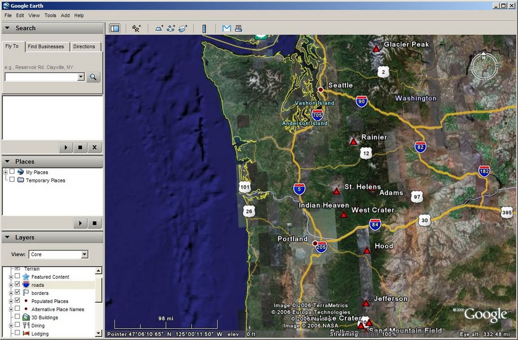
Now you can start to see things like the road network, major cities and major geographic features, just like you asked for. What we also see is the differences in imagery coverage that has been mosaicked and tiled so as to give the best possible resolution for this database. Different types of imaging systems at different times of day with different characteristics yields differences in tone and contrast, so those show up visibly.
Yes, this was something that in 1996 you could only have hand made for your use at relatively high cost. Today, it is free for the asking.
Now to get some real neat data we can use the preformatted information from the US Geological Survey Real Time Earthquake Data. The link is here and the installation is 'auto-magic' as Google Earth will automatically detect the link type and install it as an available option in the Places portion of the menu and turn it on for you. Now I will pull out just a bit so that more information can be shown.
Look at all that data that the US taxpayer pays for now showing up for FREE on your screen! And even better is that you can click on any of this and get, immediately, what it is and what it means. So if I click on that big old arrow out there with the 39mm and pointing to the North East I will get the following: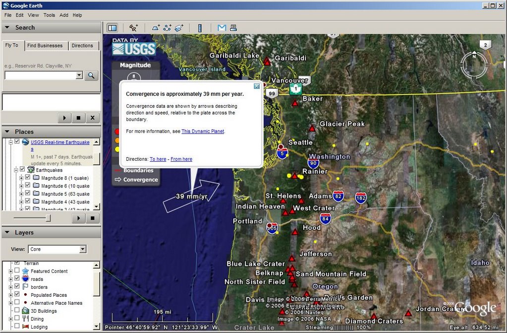
Which tells me that the geologic plate out under the pacific is moving at 39mm per year under the North American plate at that boundary. And all those lovely yellow dots are earthquakes that have happened in the past week. Just yummy!
Now, lets say that you wanted to add in the USGS water flow data to see what that looked like. Well it is as simple as going to their WaterWatch website and noticing that they have a Google Earth KML feed and clicking on that. KML is the XML version of information feed for Google Earth data and similar is used to feed the RSS data for information. Now the page that you get hands you two different types of data feed one that is hourly pushed and the other that is refreshable and hourly so that it self-refreshes at need. Sounds good, so I will take the latter and have the auto-magic install of that into my toolbar and basic feed overlay streamed into the window. Now, as there are untold hundreds of water gauges across the US varying from automatic update to some poor sap has to go and hike out to the middle of nowhere to record the data in a field book and hike back with it sort, you get a LOT of data. The map will *also* try to zoom OUT to take in the entire planet so you can see the entire data set, which is a bit of a pain.
So I will expand the sidebar for this and turn off the entire data set and turn on only the extreme range of the data set. The amount of time streaming the entire thing to your desktop is a bit much, but if you are willing to wait, it is a good data set for looking at things like stream runoff, and use only the <10th>90 percentile plus the very top and bottom of the range.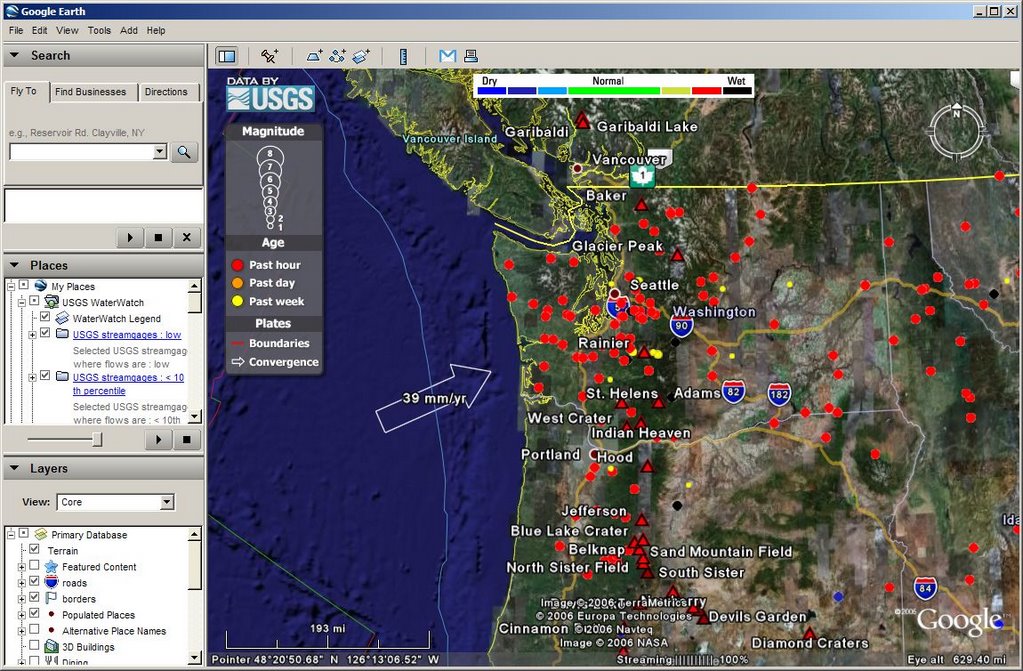
Now these may seem like two, relatively trivial data sets. But, as we know that the earthquakes are happening in rugged regions where volcanoes are, we can also see that conditions are very wet and that stream runoff is high. These are what as known as prime conditions for mass flows to be triggered by a small volcanic event. Already wet streams would be inundated by sudden meltwater and debris flows, called lahars, would then happen. So, lets say you decide to pull the RSS volcanic warning feeds from the USGS into your browser from here. And here is what the 16 NOV Mount St. Helens feed has to say:
Growth of the new lava dome inside the crater of Mount St. Helens continues, accompanied by low rates of seismicity, low emissions of steam and volcanic gases, and minor production of ash. During such eruptions, changes in the level of activity can occur over days to months. The eruption could intensify suddenly or with little warning and produce explosions that cause hazardous conditions within several miles of the crater and farther downwind. Small lahars could suddenly descend the Toutle River if triggered by heavy rain or by interaction of hot rocks with snow and ice. These lahars pose a negligible hazard below the Sediment Retention Structure (SRS) but could pose a hazard along the river channel upstream.Pretty neat, huh? You have just done an analysis of seismic data in relation to volcanoes and ferreted out that a sudden eruption with current stream conditions would be abnormally dangerous. To those of you wondering what Geospatial Intelligence Analysis is all about this is IT. You examine what you know, put new information into the picture and think about what that means. You then find additional data sources and add that into the mix to see if that changes your initial estimate.
In this case we looked at the known Pacific Northwest and pulled up landmarks that happen to contain the most prominent features in this region, which are volcanoes. We then added in earthquake information and examined that in context. Next up we put in further water flow data as so many floods with earthquakes are proving to be the on-the-ground killers outside of the actual eruption itself. Then we put those two together, realized that there might be a problem and found another data source to confirm or deny the suspicion.
Now for the added bonus question: what is everyone overlooking?
Let me zoom in and show you.

Yes, Mount Rainier. The yellow dots, by turning the earthquake feed on and off are recent, low magnitude earthquakes under and around Mount Rainier. Streamflow conditions are ALSO wet there as they are regionally. There are earthquakes under Mount St. Helens, but they are obscured directly by the symbol for it. Those are much more frequent and covered in the bulletin. There are similar bulletins for the entire cascade range for earthquakes. Finding those I can leave "up to the student".
By similar methodology, finding point sources, say terrorist acts, and then time sequencing them for an area will give how terrorist activity is happening, where it happens and allow it to be examined for type of activity and which groups claim responsibility. Do that for a place like Afghanistan or Iraq and then you can start to derive patterns of activity by group and see how they have changed over time.
Still looking for the one-stop shop for *that*, but by being able to put in your OWN points and draw your OWN areas and see how they fit with YOUR ideas you, too, can start your very own dot-connecting Intelligence service and pick and choose which dots you want to connect and then put suppositions out and add in more data that will either confirm or deny those suppositions.
All because you can now place them in CONTEXT geographically, spatially and in time.
The tools are free. Your time is your own.
If you bitch and complain about the inability of the various Intelligence and Police and Law Enforcement Agencies being unable to 'connect the dots', well guess what?
You can now DO IT YOURSELF.
You may pick up your very own dot connecting certificate by the door on your way out.
Class is dismissed.
Good luck!
You will NEED IT.


 Supporting Friends and Allies


6 comments:
In my spare time! This IS really cool, tho.
SN - Extremely cool!
I would have *killed* for this kind of capability a decade ago... this was cutting edge capability beyond what I could have imagined then. And now? Free!
It doesn't look like it is going away and the free version is more than good enough to do 95% of the basic INTEL analysis work in a coherent geospatial setting.
A-mazing!
11 22 06
AJ:
Thanks for the note about this! My husband will reallllly love these tools. He had been messing around with some free tools to make contour maps and analyze weather systems on our UNIX cluster (4 nodes only). I think he will love the applications for the software and thanks very much!
11 22 06
BTW GIS data is his favourite:)
This stuff is great. I recently used it to track the San Diego fires on my blog with great success.
KT Cat - My thanks!
This was part of my job in DoD, not only doing cartographic work but in moving to advanced R&D for visualization of data. You could not *buy* this capability... literally couldn't purchase it nor implement it in a secure environment. I get disabled and when I finally regain my wits enough to look around a year or so later here it is for *free* on GE!
So much for AR&D.
Still I would like this melded with a true 3D construction environment, like in Secondlife... the entire scope from global to personal views by photos would have been a gift from the heavens a few years back. I suspect it will be free before 2010.
Post a Comment